

Involuntary disruption

Product design

Inheriting a 20-year-old, outdated product that struggled to handle British Airways' disrupted customers, I worked with teams across the company to drive a 14% increase in the number of customers who successfully resolved their disruptions online via our tool, before creating a new app.

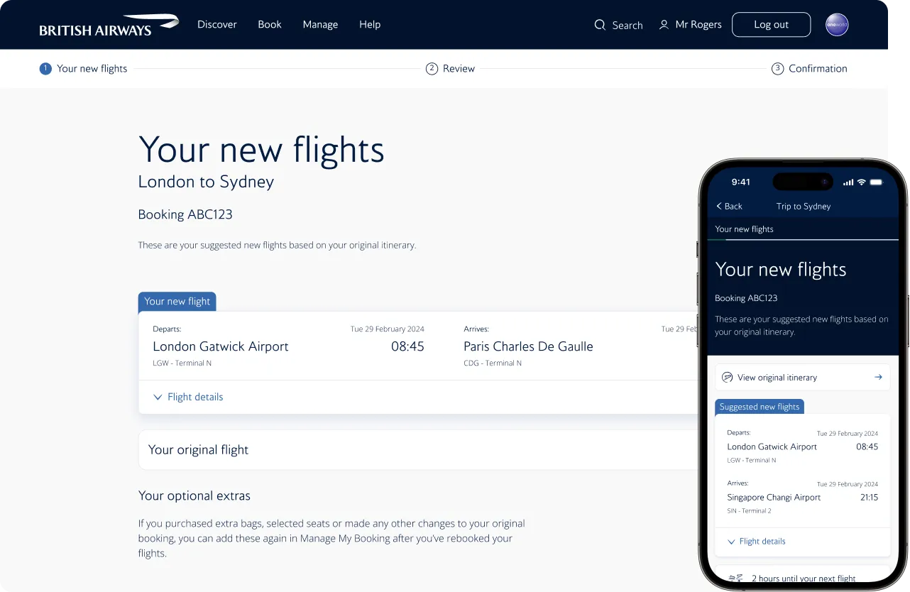
British Airways "Your new flights" screen on desktop and in the app, suggesting a replacement flight from London Gatwick to Paris Charles de Gaulle.

Overview

Resolving disruption

I was placed in one of the most complex product areas in the business — Involuntary Disruption, otherwise known internally as ‘Invol’. A self-service tool for customers to manage cancelled or delayed journeys, it had been neglected for 20 years because it drove no direct revenue. Then COVID made disruption constant, and a tool nobody had maintained became a tool everybody needed.

Beneath the surface it was a hybrid of five legacy back-end systems — slow, unreliable, inaccessible, and pushing stressed customers to £14-a-call contact centres. My job was to make it work. Halfway through, BA began replatforming its entire digital estate and I moved to the new app team, where I got to rethink disruption from scratch. Despite this, my designs contributed to a 14% increase in disruptions being resolved online, which saved the business approximately £3.2 million, and much more in reputational damage.

Product timeline
Mar 2023 - March 2025
Role + responsibility
Product Designer → Senior Product Designer — owned end-to-end design and research for the disruption product, from discovery through dev handover, often working solo
Team + tools
Cross-functional agile squad (PO, scrum master, BA, engineers)
Figma | User Testing | Data Dog | Confluence

The problem

On the surface, a simple self-service tool: accept a replacement flight, find an alternative, or take a refund. Underneath, a nightmare of five legacy tools and esoteric business rules that made it slow, confusing and unreliable — and critically, inaccessible. For a product designed to help people who are already stressed and stranded, that was a serious problem.

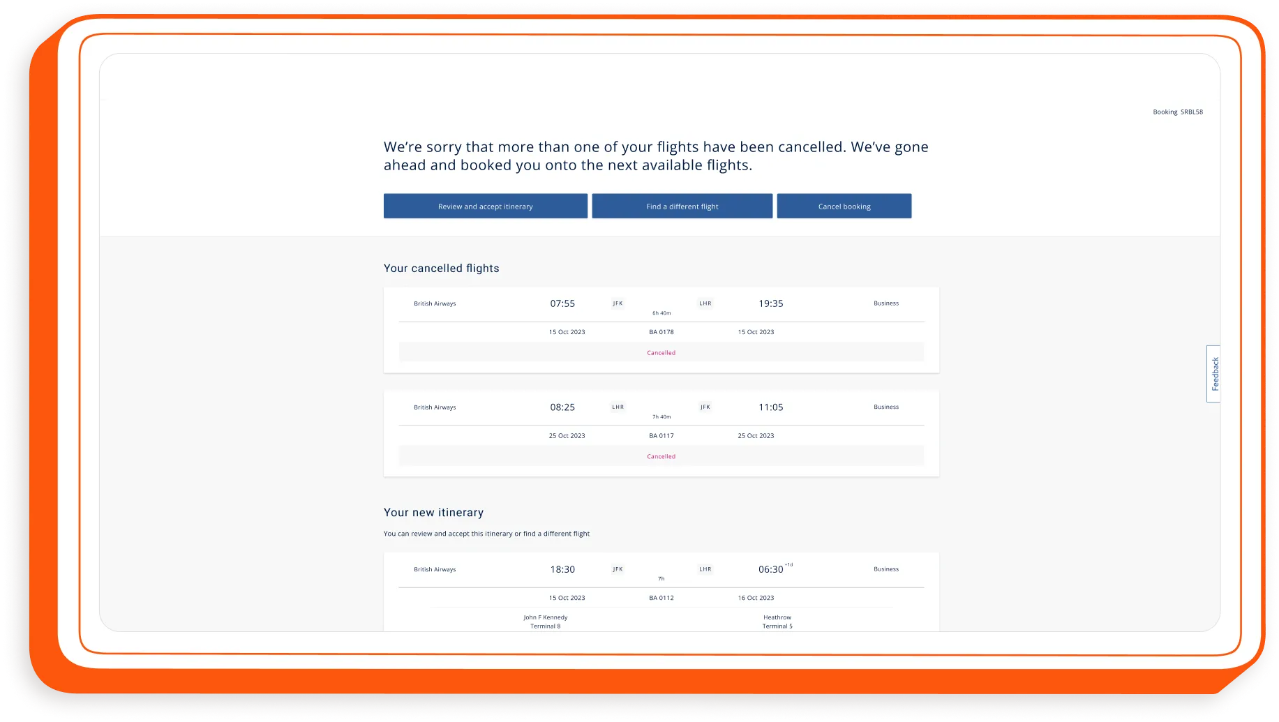
The old disruption tool: a desktop page listing two cancelled flights and a new itinerary, with buttons to accept it, find a different flight or cancel the booking.

The solution

Threading this particular needle was a significant challenge. It required extensive stakeholder relationship building across BA, a vast organisation of over 30,000 people, to gain access to key resources and information. To achieve our accessibility goals, I learned and contributed to BA's exceptional design system (BAgel), which was created with accessibility at its core. Rethinking our product also involved elevating our approach to research, testing, and prototyping, all of which I used to help shape the strategy of my squad.

Project timeline. Recurring, Discovery, Mar 23 to Dec 24: several trips to BA’s call centres to talk to angry customers; testing prototypes in Heathrow T5 with very angry customers; dozens of research sprints with decreasingly angry customers. Phase 1, Accessibility, Jul 23 to Sep 23: redesigned the Invol product end to end in two months; decreased the WCAG barrier score from 65% to 15%; avoided huge fines from the CAA and won an award. Phase 2, Redesign, Oct 23 to Dec 24: improved Invol’s UX, reducing disruption call centre volume by 14%; seconded to a new team to replatform BA.com; rebuilt Invol to be an app-first experience, from a web-only one.

Recurring - Discovery

Understanding disruption

Diving straight in, I went direct to our disruption call centre in Manchester and spoke to staff who revealed a lot about our existing online tool:

  1. it was unreliable and unclear,
  2. it didn’t suggest suitable alternate flights,
  3. it often didn’t handle on the day disruptions,
  4. it didn’t handle complex (connecting journey) disruptions,
  5. it didn’t handle paid for extras (seats/baggage etc),
  6. people generally liked the reassurance of a real person.

These reasons drove a lot of customers to the call centre, and at £14 per call this was costing the business millions and significant reputational damage.

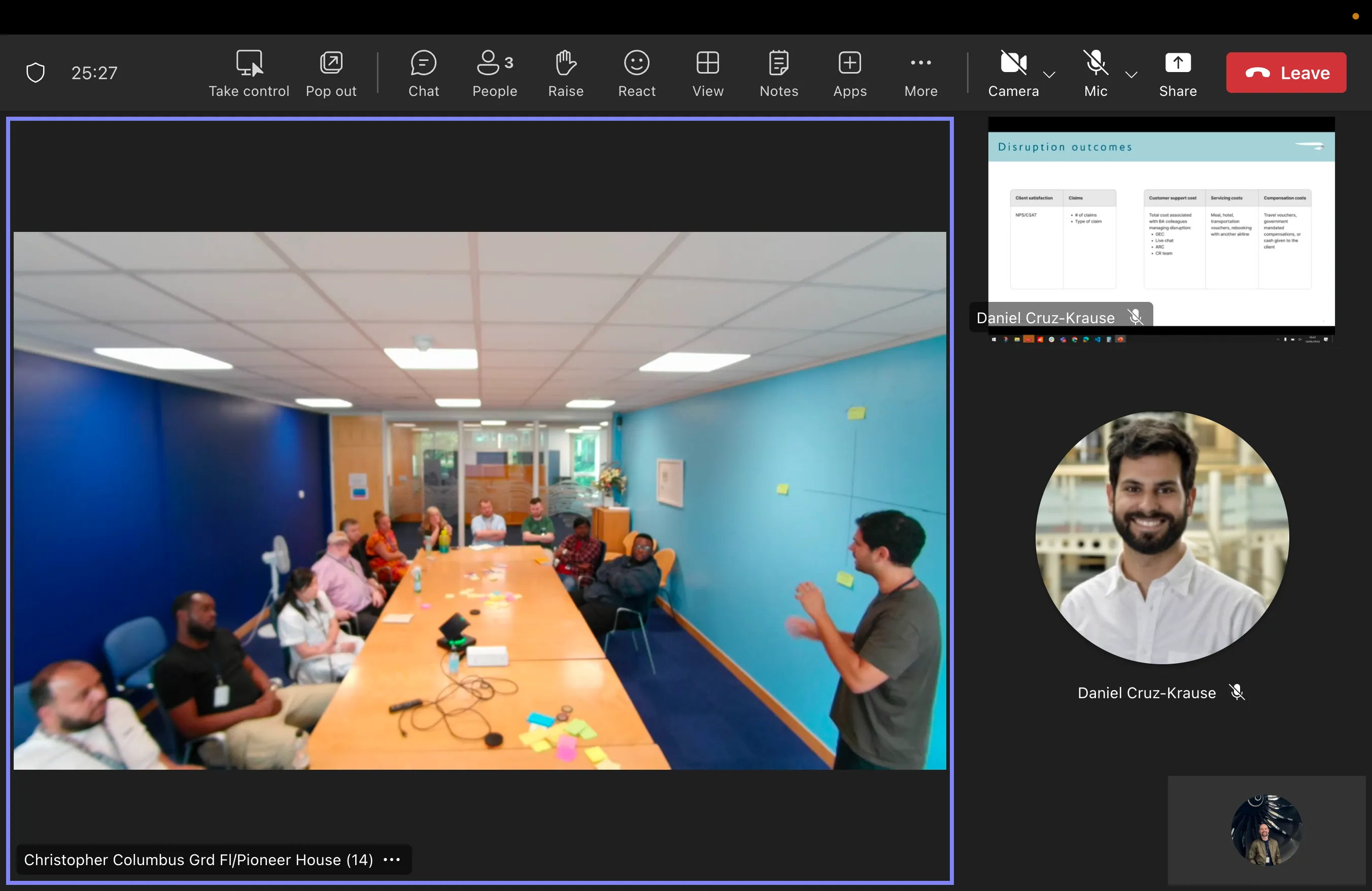
A video call of the workshop at BA’s disruption call centre in Manchester, with staff around a meeting table.
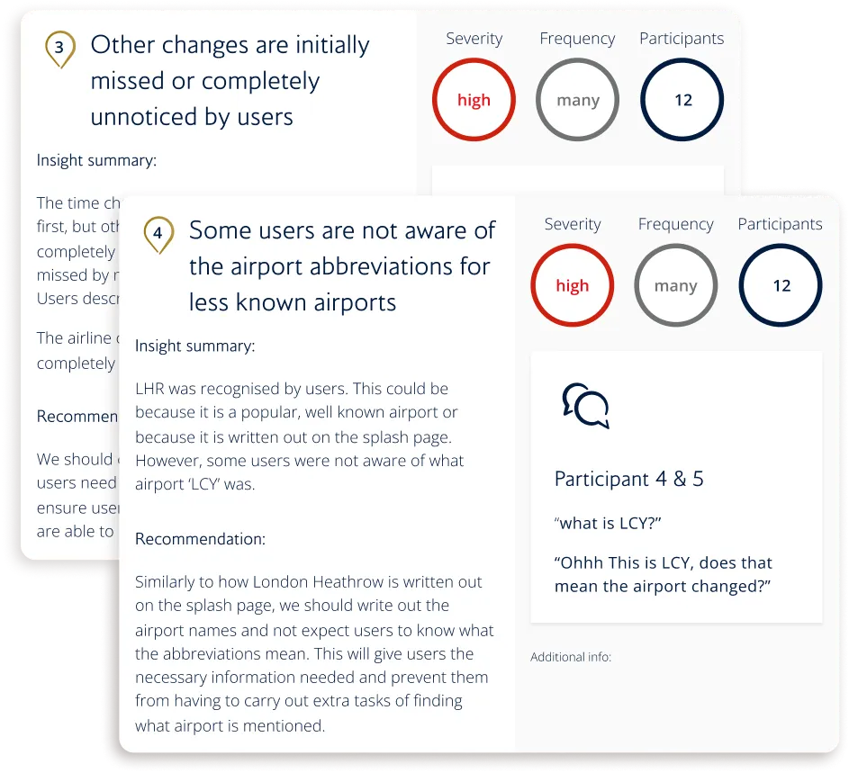
Two research insight cards, both rated high severity: "Other changes are initially missed or completely unnoticed by users" and "Some users are not aware of the airport abbreviations for less known airports".

What did users think?

Gathering user feedback was next. We ran a dozen contextual inquiries and found that the product had plenty of design flaws, which, given that it was designed to help stressed and overwhelmed users, didn’t bode well.

One major issue was that users often missed vital information due to its design. For example, airport names - represented by their three-character codes - were overlooked by 60% of users.

Through our interviews and user tests we discovered their main gripe: if an airline couldn’t find a good alternative flight. Most said “I’ll never fly with them again” - lining up nicely with what we learned in Manchester.

British Airways’ customers

  • 38%of users got stuck using the product
  • 60%of users missed changes to key flight info
  • 66%of users wanted someone to talk to
  • 88%of users wanted info on purchased extras

Phase one - Accessibility

Getting accessible

Before I joined, my squad had been working on making our 20+-year-old product accessible; however, without a designer, their approach was purely tech-oriented. As I got acquainted with the team and project, it was clear urgent intervention was needed, especially with a looming November deadline from the Civil Aviation Authority (CAA), threatening fines if we didn't meet specific accessibility standards.

The original disruption page beside the first accessible redesign of "Your disruptions".

The “WTAF” moment

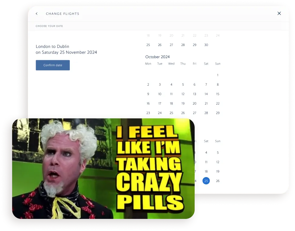
As I was getting settled into my new squad I was consulted on making our product’s date picker PAGE accessible. For many many reasons, this wasn’t possible and I stepped in to do some vital course corrections.

Their focus was solely on fixes to the code, markup text, and page order - which left unchecked would have meant screen reader users having to tab through an endless 365-day calendar page to find new flights.

Whilst this was no-one’s fault within the team, this was a very early test of my mettle and I quickly stepped into a leadership capacity to right the ship so we could meet these tight deadlines.

The old date picker page with a full-year calendar, next to an "I feel like I’m taking crazy pills" meme.
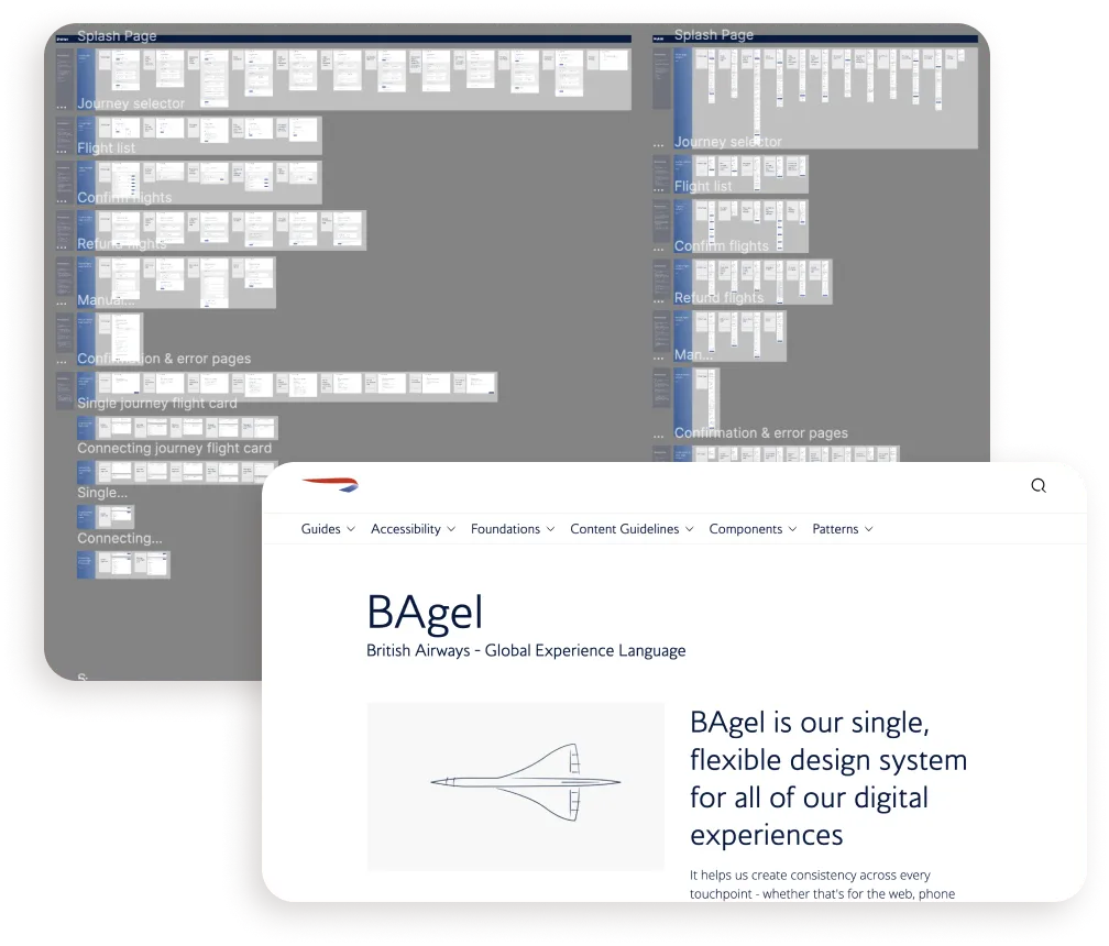
A wall of BAgel design system components beside the BAgel design system home page.

Owning accessibility

When I joined, my squad was just nine months old and still finding its feet, with no prior front-end experience. Leveraging BA’s relatively new design system, BAgel, I redesigned our product end-to-end.

This caused some friction initially, as my squad - who had already worked very hard on their solutions - believed their work had been for nothing but we caught things just in time, avoiding any sunk costs.

Using pre-built, accessible-by-default components we sped up the process, avoiding the need for complex coding gymnastics, and by ensuring I stayed on hand at all times I built strong bonds within my new squad.

The everything BAgel

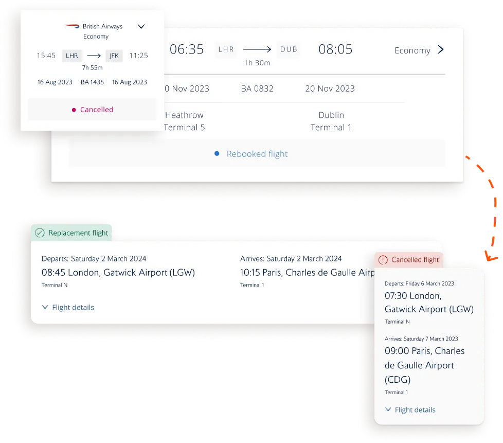
Since our design system, BAgel, is always evolving I got involved in refining a few experimental components and patterns, in particular the new flight card pattern.

Leveraging ongoing discovery work and user testing, we found that “less is more” in terms of information at this stage for users. Only vital information was necessary and this vastly improved comprehension for our users.

Serving several purposes this process made our product accessible, laid the groundwork for the larger product redesign and created a steady flow of design work to foster an efficient, agile process for my front-end devs.

The redesigned flight card pattern, showing a cancelled flight and its replacement.

Invol accessible

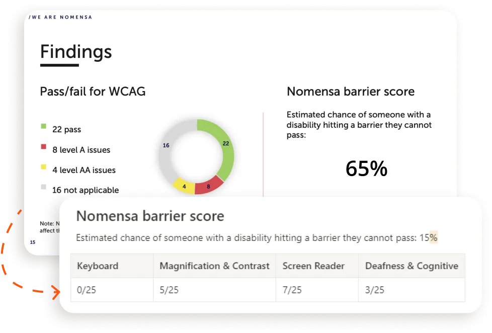
An accessibility audit: 22 WCAG passes and a Nomensa barrier score of 65%.

Embedding accessibility

Working with an agency specialising in accessibility, our product initially scored a WCAG barrier score of 65%. By early 2024, our score was 15% and continuing to drop.

Award-winning accessibility

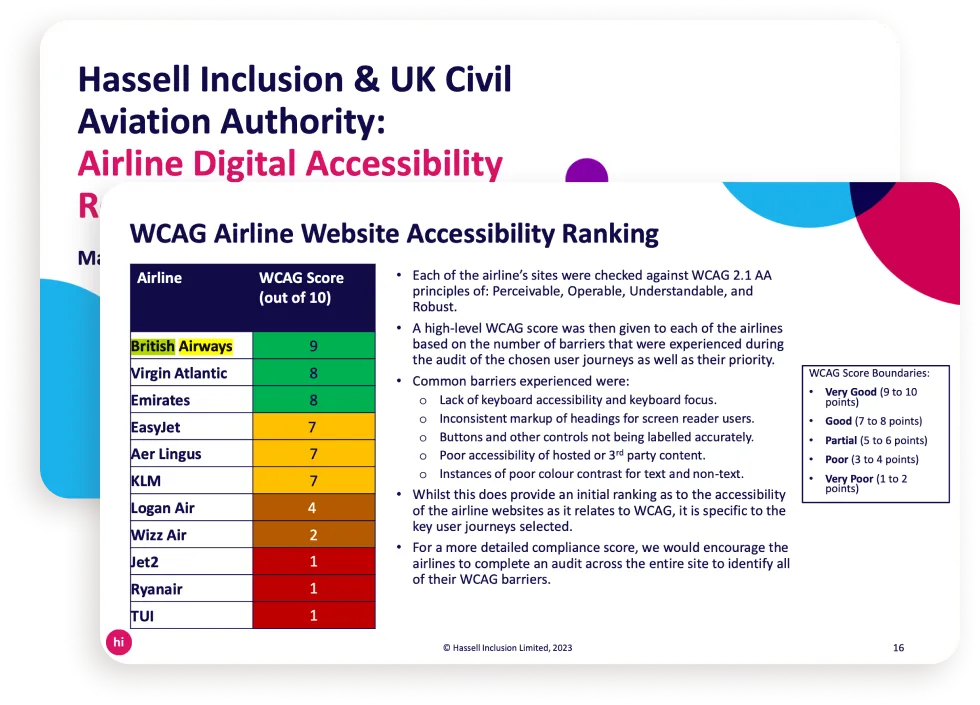
Not only did we avoid fines from the Civil Aviation Authority, we were number one in their Airline Website Accessibility Ranking for 2023.

The Hassell Inclusion and UK Civil Aviation Authority airline website accessibility ranking, with British Airways at the top.

Phase two - Redesign

Improving disruption

Combining the accessibility work with research and user testing, we formed a clear picture of how to improve Involuntary Disruption. Knowing that we were moving to a new and improved tech stack, we staggered our re-design and development efforts into two phases. This approach ensured we resolved a lot of pain points while setting a solid foundation for future improvements by ensuring our tool could handle any disruption scenario.

Redesigned disruption hub screens for London to Paris and London to Sydney journeys, on desktop and mobile.

What came first

In the 20+ years since our product had been live, Amadeus - the backbone of our tool and the aviation industry - has evolved and can now deal with far more complex scenarios. Our front-end had not.

Complex disruptions involved two or more connecting journeys that had at least one flight automatically rebooked by BA while the others hadn’t been, requiring the user to fix it themselves. This was surprisingly common.

In these cases, the customer would have to call BA and for £14 per call for BA, the call centres were costly. Allowing more people to self-serve was, therefore, a no-brainer for driving down unnecessary business costs!

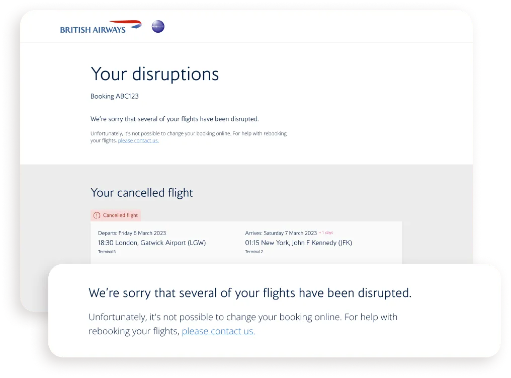
The redesigned "Your disruptions" page, showing a cancelled flight and a message that the booking can’t be changed online.

Invol reimagined

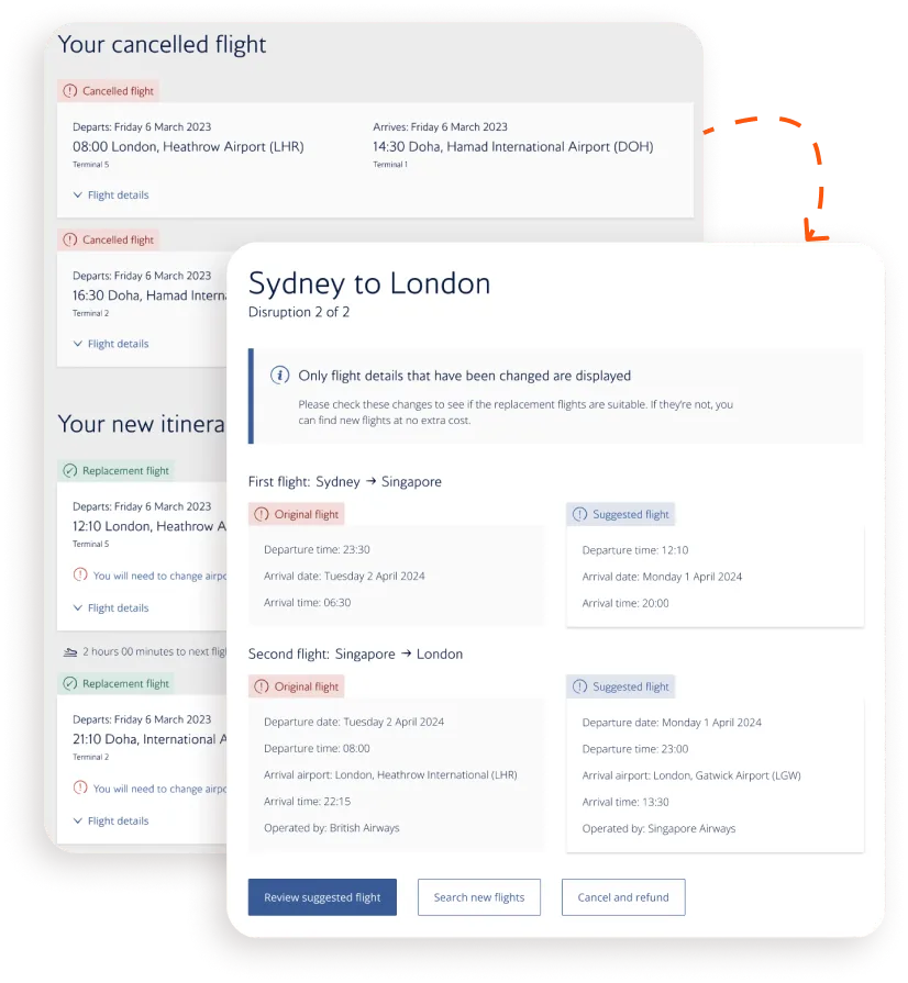
Cancelled and replacement flights for a Sydney to London journey shown side by side.

Spotting the difference

Using progressive disclosure and a side-by-side design, we created a UX that handled complex scenarios. Its simplicity and clear messaging also meant that users missed far fewer key details - from 60% to just 8%.

Making Invol make sense

Adding little bits of friction, in the form of summary pages, after accepting or choosing new flights, drastically reduced the number of overwhelmed and confused users, who made up almost 1/3 of our calls.

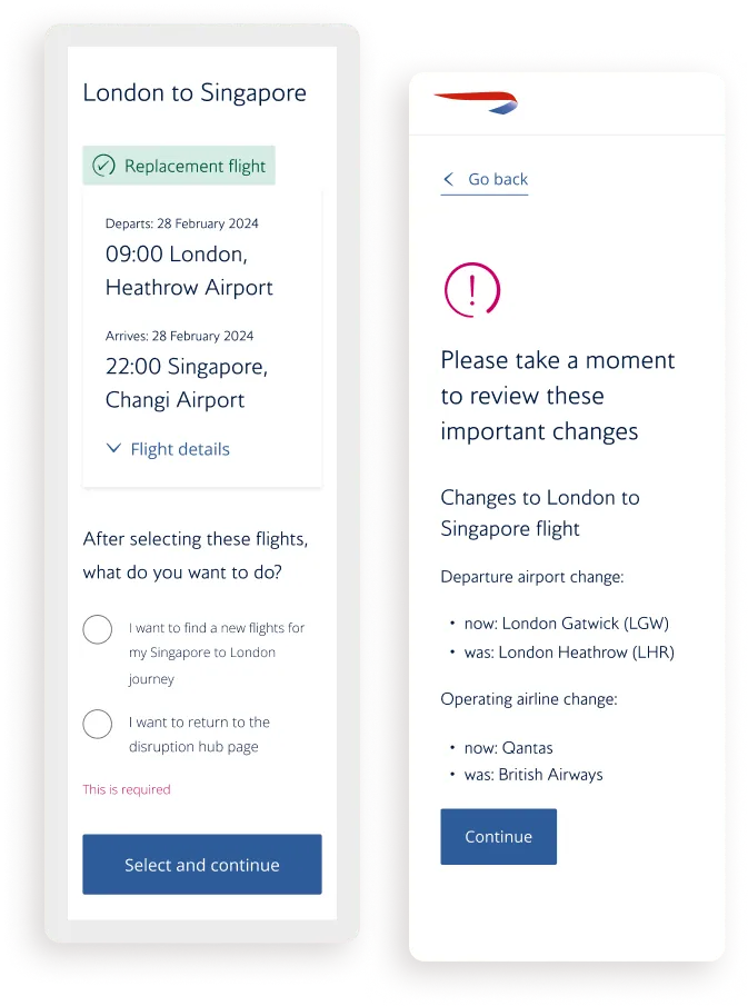
Two mobile screens: a replacement flight summary and a page asking the customer to review important changes.
Live chat with a BA agent inside the disruption tool, on desktop and mobile.

A personal touch

We introduced live chat, allowing users to speak with someone—a major request from 66% of people we interviewed. This took pressure off the call centre, as live chat staff could manage multiple conversations at once.

Initial success

While our product still couldn't handle paid for extras or on the day disruption - issues to be addressed on our new tech stack - we significantly improved the user experience. Improving the design in this way contributed to a modest 14% lift in number of users able to successfully resolve their disruption online and without any intervention from the BA call centres by the time I moved over to the replatforming team, leaving BA.com behind.

A line chart of disruptions resolved online, rising over time.

Bringing Invol to our app

Having completed phase one, and with designs and testing either already done or well underway for phase two, we now looked at how we could leverage the new technologies at our disposal to create an industry leading product. Whilst I wasn’t at BA to see the new app go live, the work we did laid the foundation for the whole organisation to rethink how it managed disruption going forward.

News headlines about British Airways’ digital problems and its new app, from the Guardian, the Telegraph and Business Insider.

Starting afresh

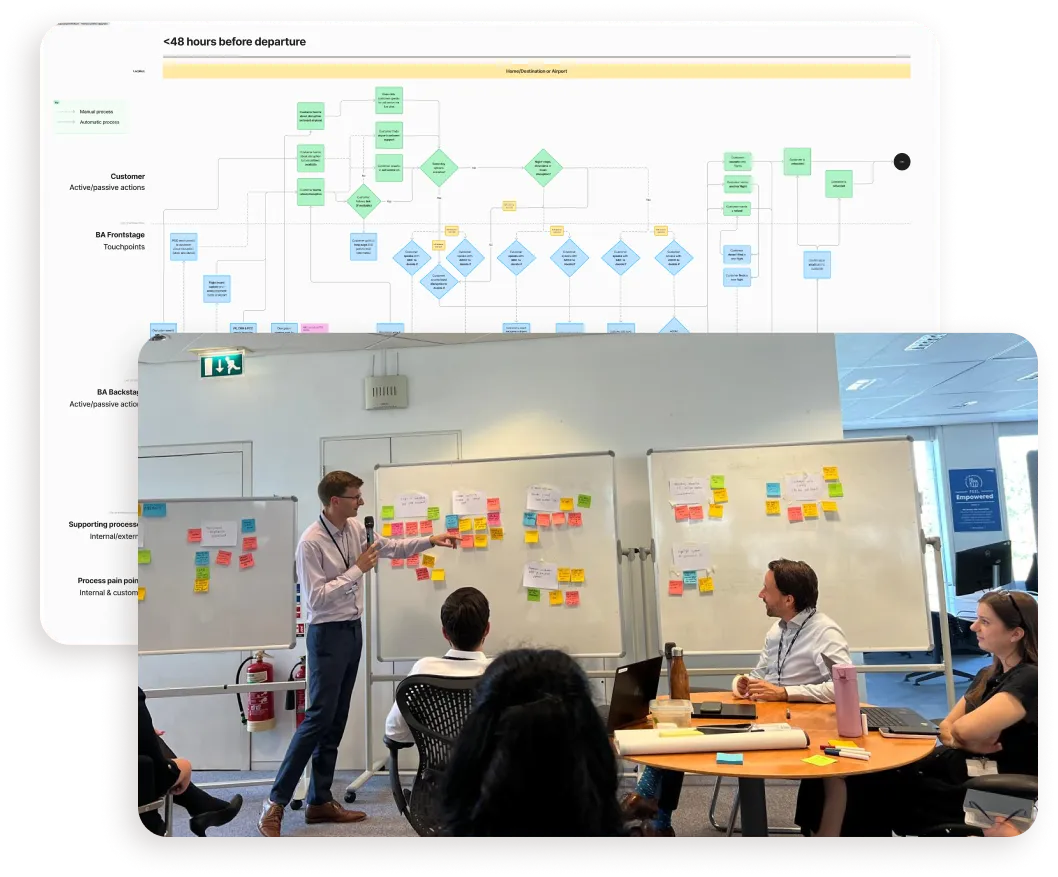
Casting the net wide I led a design sprint with teams from across BA who handled parts of disruption, such as airport operations, CRM and the call centre.

This built relationships and created alignment, allowing me to follow-up with a thorough service mapping of disruption that visualised its problems and where they sat.

This ultimately led to an organisational redesign. Digital was no longer an afterthought, it was driving disruption - and the direction was a new and fully integrated end-to-end experience built into our new app.

A service map of the disruption journey and a design sprint workshop with teams from across BA.

Invol for app

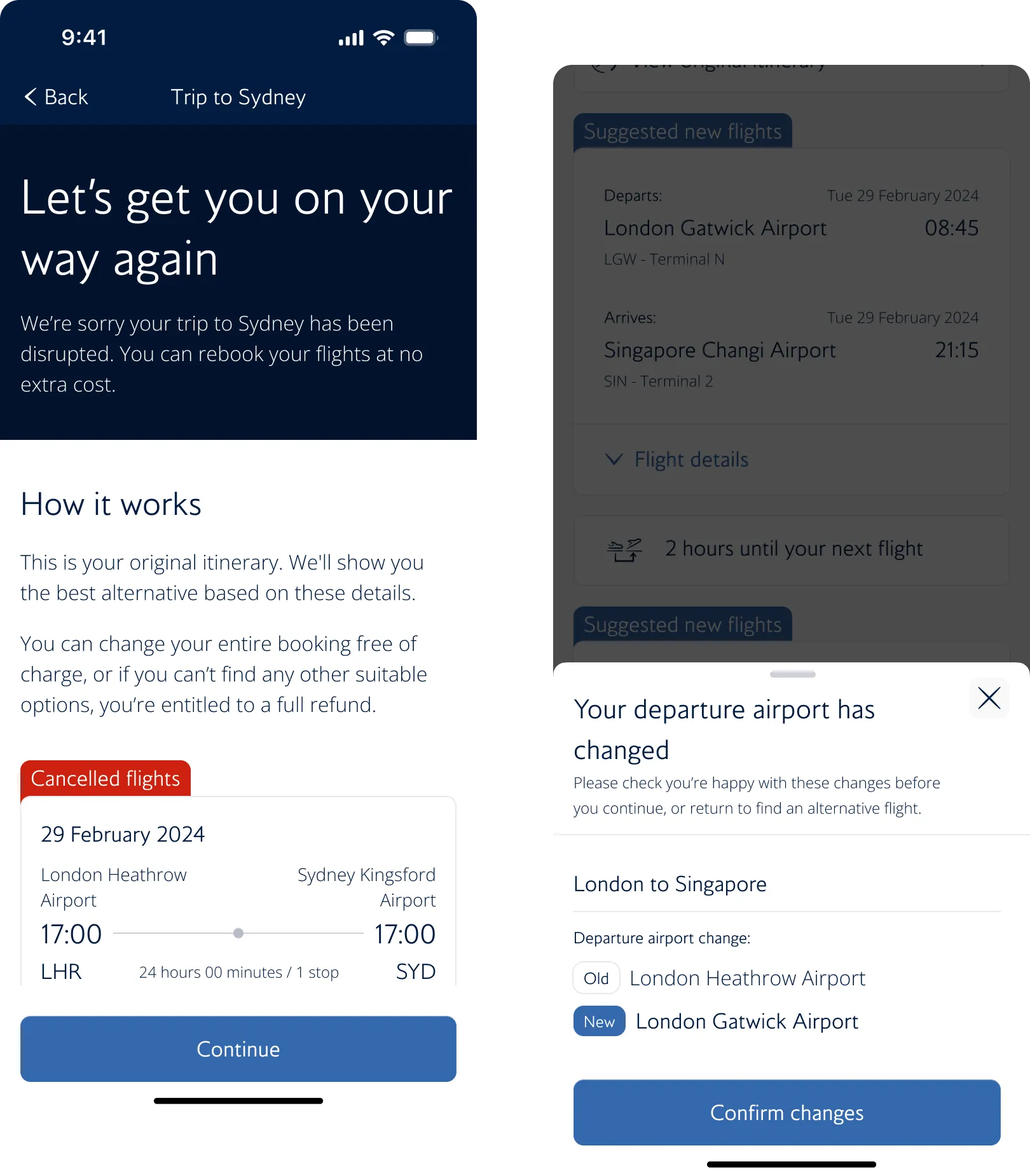
App screens: "Let’s get you on your way again" and "Your departure airport has changed".

Democratising disruption

Designing for mobile was a different proposition. Achieving a 95% success rate when we tested a prototype in Heathrow, new pages and ways of catching the user allowed us to create a truly robust disruption tool.

Adding ancillaries

Answering the 88% of customers demanding information about extras they had bought, we achieved this by allowing users to manage everything from seating to baggage within the new disruption tool.

App screens for keeping optional extras and choosing a new seat during a disruption.
App screens for a light refreshment voucher that can be added to Apple Wallet.

Digitising compensation

A little-known part of BA’s disruption offering is that we offer customers light refreshment vouchers. These were, however, paper based. With our new remit, we digitised that and made it super easy to access via the app.

Invol 2.0

Sadly I didn’t get to see the project through to completion; however, the pride I feel having dragged Involuntary Disruption out of the dark ages and into the 21st century is something I’m very happy about and I look forward to seeing how it continues to evolve.

The Amadeus British Airways quick reference guide beside splash page designs for the new app.

What I learned

A man giving a knowing smile.
  1. Leadership: Starting out in a product squad that had little to no design experience was a significant challenge, but it presented an opportunity for me to step up into a design leadership capacity, something I enjoyed and really hope to continue.

  2. Accessibility: Learning about and utilising an accessible design process has been one of the most important things I’ve developed while at British Airways, evolving my skills and teaching me to see design through this important lens.

  3. Rapid testing: Getting very familiar with User Testing and working with some very talented researchers, I learned the importance of rapid user testing to gather useful insights quickly. This enabled me and my squad to make quick decisions when needed, proving invaluable.

  4. Taking the initiative: Whilst this mightn’t be something I learned to do at British Airways, it is something I developed. When there was a need to work on something unfamiliar (such as the boarding pass) I didn’t pass on the opportunity, always seizing on them to develop my skills.

Involuntary disruption

Product design

Inheriting a 20-year-old, outdated product that struggled to handle British Airways' disrupted customers, I worked with teams across the company to drive a 14% increase in the number of customers who successfully resolved their disruptions online via our tool, before creating a new app.
British Airways "Your new flights" screen on desktop and in the app, suggesting a replacement flight from London Gatwick to Paris Charles de Gaulle.

Overview

Resolving disruption

I was placed in one of the most complex product areas in the business — Involuntary Disruption, otherwise known internally as ‘Invol’. A self-service tool for customers to manage cancelled or delayed journeys, it had been neglected for 20 years because it drove no direct revenue. Then COVID made disruption constant, and a tool nobody had maintained became a tool everybody needed.

Beneath the surface it was a hybrid of five legacy back-end systems — slow, unreliable, inaccessible, and pushing stressed customers to £14-a-call contact centres. My job was to make it work. Halfway through, BA began replatforming its entire digital estate and I moved to the new app team, where I got to rethink disruption from scratch. Despite this, my designs contributed to a 14% increase in disruptions being resolved online, which saved the business approximately £3.2 million, and much more in reputational damage.

Product timeline
Mar 2023 - March 2025
Role + responsibility
Product Designer → Senior Product Designer — owned end-to-end design and research for the disruption product, from discovery through dev handover, often working solo
Team + tools
Cross-functional agile squad (PO, scrum master, BA, engineers)
Figma | User Testing | Data Dog | Confluence

The problem

On the surface, a simple self-service tool: accept a replacement flight, find an alternative, or take a refund. Underneath, a nightmare of five legacy tools and esoteric business rules that made it slow, confusing and unreliable — and critically, inaccessible. For a product designed to help people who are already stressed and stranded, that was a serious problem.
The old disruption tool: a desktop page listing two cancelled flights and a new itinerary, with buttons to accept it, find a different flight or cancel the booking.

The solution

Threading this particular needle was a significant challenge. It required extensive stakeholder relationship building across BA, a vast organisation of over 30,000 people, to gain access to key resources and information. To achieve our accessibility goals, I learned and contributed to BA's exceptional design system (BAgel), which was created with accessibility at its core. Rethinking our product also involved elevating our approach to research, testing, and prototyping, all of which I used to help shape the strategy of my squad.

Project timeline. Recurring, Discovery, Mar 23 to Dec 24: several trips to BA’s call centres to talk to angry customers; testing prototypes in Heathrow T5 with very angry customers; dozens of research sprints with decreasingly angry customers. Phase 1, Accessibility, Jul 23 to Sep 23: redesigned the Invol product end to end in two months; decreased the WCAG barrier score from 65% to 15%; avoided huge fines from the CAA and won an award. Phase 2, Redesign, Oct 23 to Dec 24: improved Invol’s UX, reducing disruption call centre volume by 14%; seconded to a new team to replatform BA.com; rebuilt Invol to be an app-first experience, from a web-only one.

Discovery

Understanding disruption

Diving straight in, I went direct to our disruption call centre in Manchester and spoke to staff who revealed a lot about our existing online tool:

  • It was unreliable and unclear
  • It didn’t suggest suitable alternate flights
  • It often didn’t handle on the day disruptions
  • It didn’t handle complex connecting journeys
  • It didn’t handle paid for extras (seats/baggage)
  • People liked the reassurance of a real person

These reasons drove a lot of customers to the call centre, and at £14 per call this was costing the business millions and significant reputational damage.
A video call of the workshop at BA’s disruption call centre in Manchester, with staff around a meeting table.
Two research insight cards, both rated high severity: "Other changes are initially missed or completely unnoticed by users" and "Some users are not aware of the airport abbreviations for less known airports".

What did users think?

Gathering user feedback was next. We ran a dozen contextual inquiries and found that the product had plenty of design flaws, which, given that it was designed to help stressed and overwhelmed users, didn’t bode well.

One major issue was that users often missed vital information due to its design. For example, airport names - represented by their three-character codes - were overlooked by 60% of users.

Through our interviews and user tests we discovered their main gripe: if an airline couldn’t find a good alternative flight. Most said “I’ll never fly with them again” - lining up nicely with what we learned in Manchester.

British Airways’ customers

  • 38%of users got stuck using the product
  • 60%of users missed changes to key flight info
  • 66%of users wanted someone to talk to
  • 88%of users wanted info on purchased extras

Phase one - Accessibility

Getting accessible

Before I joined, my squad had been working on making our 20+-year-old product accessible; however, without a designer, their approach was purely tech-oriented. As I got acquainted with the team and project, it was clear urgent intervention was needed, especially with a looming November deadline from the Civil Aviation Authority (CAA), threatening fines if we didn't meet specific accessibility standards.
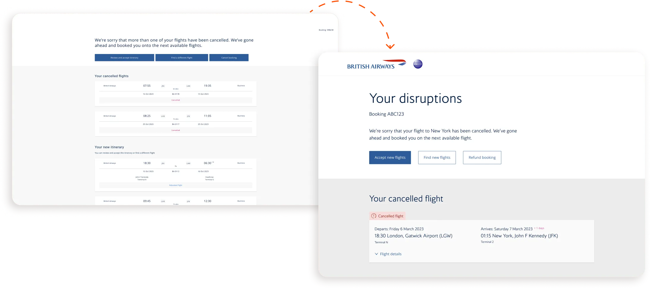
The original disruption page beside the first accessible redesign of "Your disruptions".
The old date picker page with a full-year calendar, next to an "I feel like I’m taking crazy pills" meme.

The “WTAF” moment

As I was getting settled into my new squad I was consulted on making our product’s date picker PAGE accessible. For many reasons, this wasn’t possible and I stepped in to do some vital course corrections. Their focus was solely on fixes to the code, markup text, and page order - which left unchecked would have meant screen reader users having to tab through an endless 365-day calendar page to find new flights.

Owning accessibility

When I joined, my squad was just nine months old and still finding its feet, with no prior front-end experience. Leveraging BA’s relatively new design system, BAgel, I redesigned our product end-to-end. This caused some friction initially, as my squad - who had already worked very hard on their solutions - believed their work had been for nothing but we caught things just in time, avoiding any sunk costs.

A wall of BAgel design system components beside the BAgel design system home page.
The redesigned flight card pattern, showing a cancelled flight and its replacement.

The everything BAgel

Since our design system, BAgel, is always evolving I got involved in refining a few experimental components and patterns, in particular the new flight card pattern. Leveraging ongoing discovery work and user testing, we found that “less is more” in terms of information at this stage for users. Only vital information was necessary and this vastly improved comprehension for our users.

Invol accessible

Embedding accessibility

Working with an agency specialising in accessibility, our product initially scored a WCAG barrier score of 65%. By early 2024, our score was 15% and continuing to drop.

An accessibility audit: 22 WCAG passes and a Nomensa barrier score of 65%.
The Hassell Inclusion and UK Civil Aviation Authority airline website accessibility ranking, with British Airways at the top.

Award-winning accessibility

Not only did we avoid fines from the Civil Aviation Authority, we were number one in their Airline Website Accessibility Ranking for 2023.
Phase two - Redesign

Improving disruption

Combining the accessibility work with research and user testing, we formed a clear picture of how to improve Involuntary Disruption. Knowing that we were moving to a new and improved tech stack, we staggered our re-design and development efforts into two phases. This approach ensured we resolved a lot of pain points while setting a solid foundation for future improvements by ensuring our tool could handle any disruption scenario.
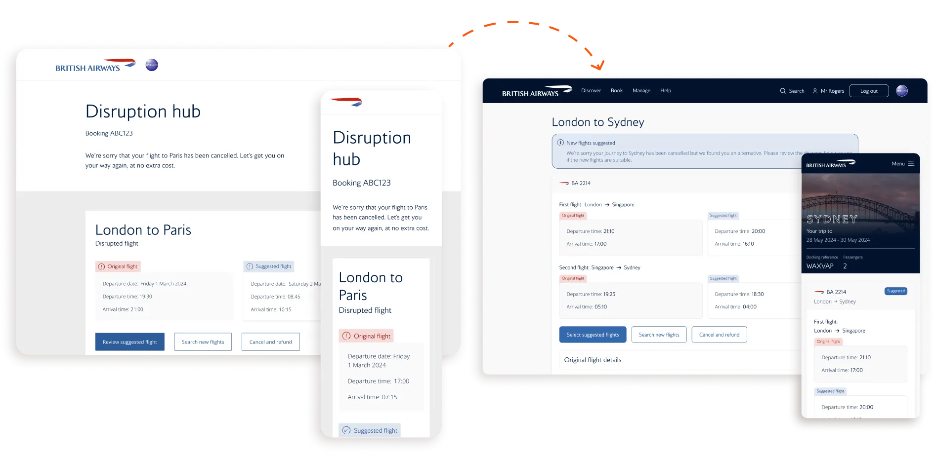
Redesigned disruption hub screens for London to Paris and London to Sydney journeys, on desktop and mobile.

What came first

In the 20+ years since our product had been live, Amadeus - the backbone of our tool and the aviation industry - has evolved and can now deal with far more complex scenarios. Our front-end had not. Complex disruptions involved two or more connecting journeys that had at least one flight automatically rebooked by BA while the others hadn't been, requiring the user to fix it themselves.

The redesigned "Your disruptions" page, showing a cancelled flight and a message that the booking can’t be changed online.

Invol reimagined

Spotting the difference

Using progressive disclosure and a side-by-side design, we created a UX that handled complex scenarios. Its simplicity and clear messaging also meant that users missed far fewer key details - from 60% to just 8%.

Cancelled and replacement flights for a Sydney to London journey shown side by side.
Two mobile screens: a replacement flight summary and a page asking the customer to review important changes.

Making Invol make sense

Adding little bits of friction, in the form of summary pages, after accepting or choosing new flights, drastically reduced the number of overwhelmed and confused users, who made up almost 1/3 of our calls.

A personal touch

We introduced live chat, allowing users to speak with someone—a major request from 66% of people we interviewed. This took pressure off the call centre, as live chat staff could manage multiple conversations at once.

Live chat with a BA agent inside the disruption tool, on desktop and mobile.

Initial success

While our product still couldn't handle paid for extras or on the day disruption - issues to be addressed on our new tech stack - we significantly improved the user experience. Improving the design in this way contributed to a modest 14% lift in number of users able to successfully resolve their disruption online and without any intervention from the BA call centres by the time I moved over to the replatforming team, leaving BA.com behind.
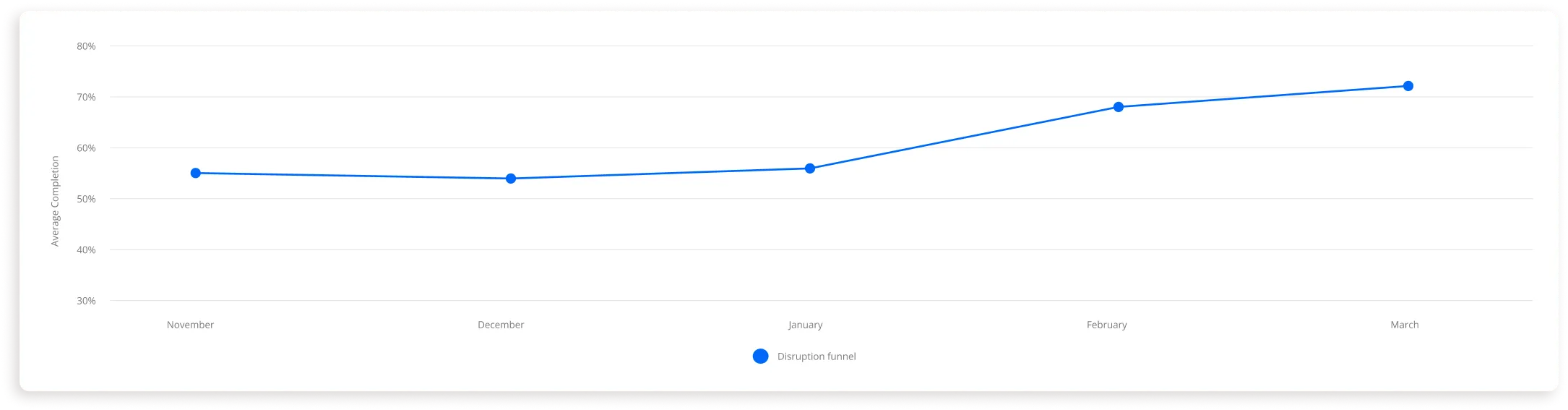
A line chart of disruptions resolved online, rising over time.

Invol for app

Democratising disruption

Designing for mobile was a different proposition. Achieving a 95% success rate when we tested a prototype in Heathrow, new pages and ways of catching the user allowed us to create a truly robust disruption tool.

App screens: "Let’s get you on your way again" and "Your departure airport has changed".
App screens for keeping optional extras and choosing a new seat during a disruption.

Adding ancillaries

Answering the 88% of customers demanding information about extras they had bought, we achieved this by allowing users to manage everything from seating to baggage within the new disruption tool.

Digitising compensation

A little-known part of BA's disruption offering is that we offer customers light refreshment vouchers. These were, however, paper based. With our new remit, we digitised that and made it super easy to access via the app.

App screens for a light refreshment voucher that can be added to Apple Wallet.

What I learned

A man giving a knowing smile.
  1. Leadership: Starting out in a product squad that had little to no design experience was a significant challenge, but it presented an opportunity for me to step up into a design leadership capacity, something I enjoyed and really hope to continue.

  2. Accessibility: Learning about and utilising an accessible design process has been one of the most important things I've developed while at British Airways, evolving my skills and teaching me to see design through this important lens.

  3. Rapid testing: Getting very familiar with User Testing and working with some very talented researchers, I learned the importance of rapid user testing to gather useful insights quickly. This enabled me and my squad to make quick decisions when needed, proving invaluable.

  4. Taking the initiative: Whilst this mightn't be something I learned to do at British Airways, it is something I developed. When there was a need to work on something unfamiliar (such as the boarding pass) I didn't pass on the opportunity, always seizing on them to develop my skills.

Want to see more?

Involuntary disruption

Product design

Inheriting a 20-year-old, outdated product that struggled to handle British Airways' disrupted customers, I worked with teams across the company to drive a 14% increase in the number of customers who successfully resolved their disruptions online via our tool, before creating a new app.

British Airways "Your new flights" screen on desktop and in the app, suggesting a replacement flight from London Gatwick to Paris Charles de Gaulle.

Overview

Resolving disruption

I was placed in one of the most complex product areas in the business - Involuntary Disruption, otherwise known internally as 'Invol'. A self-service tool for customers to manage cancelled or delayed journeys, it had been neglected for 20 years because it drove no direct revenue. Then COVID made disruption constant, and a tool nobody had maintained became a tool everybody needed.

Beneath the surface it was a hybrid of five legacy back-end systems - slow, unreliable, inaccessible, and pushing stressed customers to £14-a-call contact centres. My job was to make it work. Halfway through, BA began replatforming its entire digital estate and I moved to the new app team, where I got to rethink disruption from scratch. Despite this, my designs contributed to a 14% increase in disruptions being resolved online, which saved the business approximately £3.2 million, and much more in reputational damage.

Product timeline
Mar 2023 - March 2025
Role + responsibility
Product Designer → Senior Product Designer - owned end-to-end design and research for the disruption product, from discovery through dev handover, often working solo
Team + tools
Cross-functional agile squad (PO, scrum master, BA, engineers)
Figma | User Testing | Data Dog | Confluence

The problem

On the surface, a simple self-service tool: accept a replacement flight, find an alternative, or take a refund. Underneath, a nightmare of five legacy tools and esoteric business rules that made it slow, confusing and unreliable - and critically, inaccessible. For a product designed to help people who are already stressed and stranded, that was a serious problem.

The old disruption tool: a desktop page listing two cancelled flights and a new itinerary, with buttons to accept it, find a different flight or cancel the booking.

The solution

Threading this particular needle was a significant challenge. It required extensive stakeholder relationship building across BA, a vast organisation of over 30,000 people, to gain access to key resources and information. To achieve our accessibility goals, I learned and contributed to BA's exceptional design system (BAgel), which was created with accessibility at its core. Rethinking our product also involved elevating our approach to research, testing, and prototyping, all of which I used to help shape the strategy of my squad.

  1. RecurringDiscoveryMar 23 - Dec 24

    • Several trips to BA’s call centres to talk to angry customers
    • Testing prototypes in Heathrow T5 with very angry customers
    • Dozens of research sprints with decreasingly angry customers
  2. Phase 1AccessibilityJul 23 - sep 23

    • Redesigned the Invol product e-2-e in two months
    • Decreased the WCAG barrier score from 65% → 15%
    • Avoided huge fines from the CAA & won an award for our efforts
  3. Phase 2RedesignOct 23 - dec 24

    • Improved Invol’s core UX reducing call disruption centre volume by 14%
    • I was seconded to a new team to help replatform BA to its new app
    • I rebuilt Invol to be an app-first experience, from a web only one

Discovery

Understanding disruption

Diving straight in, I went direct to our disruption call centre in Manchester and spoke to staff who revealed a lot about our existing online tool:

  1. It was unreliable and unclear.
  2. It didn't suggest suitable alternate flights.
  3. It often didn't handle on-the-day disruptions.
  4. It didn't handle complex (connecting) journeys.
  5. It didn't handle paid for extras (seats/baggage).
  6. People liked the reassurance of a real person.

These reasons drove a lot of customers to the call centre, and at £14 per call this was costing the business millions and significant reputational damage.

A video call of the workshop at BA’s disruption call centre in Manchester, with staff around a meeting table.

What did users think?

Gathering user feedback was next. We ran a dozen contextual inquiries and found that the product had plenty of design flaws, which, given that it was designed to help stressed and overwhelmed users, didn't bode well.

One major issue was that users often missed vital information due to its design. For example, airport names - represented by their three-character codes - were overlooked by 60% of users.

Through our interviews and user tests we discovered their main gripe: if an airline couldn't find a good alternative flight. Most said "I'll never fly with them again" - lining up nicely with what we learned in Manchester.

Two research insight cards, both rated high severity: "Other changes are initially missed or completely unnoticed by users" and "Some users are not aware of the airport abbreviations for less known airports".

British Airways’ customers

  • 38%of users got stuck using the product
  • 60%of users missed changes to key flight info
  • 66%of users wanted someone to talk to
  • 88%of users wanted info on purchased extras

Phase one

Getting accessible

Before I joined, my squad had been working on making our 20+-year-old product accessible; however, without a designer, their approach was purely tech-oriented. As I got acquainted with the team and project, it was clear urgent intervention was needed, especially with a looming November deadline from the Civil Aviation Authority (CAA), threatening fines if we didn't meet specific accessibility standards.

The original disruption page beside the first accessible redesign of "Your disruptions".

The "WTAF" moment

As I was getting settled into my new squad I was consulted on making our product's date picker PAGE accessible. For many reasons, this wasn't possible and I stepped in to do some vital course corrections. Their focus was solely on fixes to the code, markup text, and page order - which left unchecked would have meant screen reader users having to tab through an endless 365-day calendar page to find new flights.

The old date picker page with a full-year calendar, next to an "I feel like I’m taking crazy pills" meme.

Owning accessibility

When I joined, my squad was just nine months old and still finding its feet, with no prior front-end experience. Leveraging BA's relatively new design system, BAgel, I redesigned our product end-to-end. This caused some friction initially, as my squad - who had already worked very hard on their solutions - believed their work had been for nothing but we caught things just in time, avoiding any sunk costs.

A wall of BAgel design system components beside the BAgel design system home page.

The everything BAgel

Since our design system, BAgel, is always evolving I got involved in refining a few experimental components and patterns, in particular the new flight card pattern. Leveraging ongoing discovery work and user testing, we found that "less is more" in terms of information at this stage for users. Only vital information was necessary and this vastly improved comprehension for our users.

The redesigned flight card pattern, showing a cancelled flight and its replacement.

Invol accessible

Embedding accessibility

Working with an agency specialising in accessibility, our product initially scored a WCAG barrier score of 65%. By early 2024, our score was 15% and continuing to drop.

An accessibility audit: 22 WCAG passes and a Nomensa barrier score of 65%.

Award-winning accessibility

Not only did we avoid fines from the Civil Aviation Authority, we were number one in their Airline Website Accessibility Ranking for 2023.

The Hassell Inclusion and UK Civil Aviation Authority airline website accessibility ranking, with British Airways at the top.

Phase two

Improving disruption

Combining the accessibility work with research and user testing, we formed a clear picture of how to improve Involuntary Disruption. Knowing that we were moving to a new and improved tech stack, we staggered our re-design and development efforts into two phases. This approach ensured we resolved a lot of pain points while setting a solid foundation for future improvements by ensuring our tool could handle any disruption scenario.

Redesigned disruption hub screens for London to Paris and London to Sydney journeys, on desktop and mobile.

What came first

In the 20+ years since our product had been live, Amadeus - the backbone of our tool and the aviation industry - has evolved and can now deal with far more complex scenarios. Our front-end had not. Complex disruptions involved two or more connecting journeys that had at least one flight automatically rebooked by BA while the others hadn't been, requiring the user to fix it themselves.

The redesigned "Your disruptions" page, showing a cancelled flight and a message that the booking can’t be changed online.

Invol reimagined

Spotting the difference

Using progressive disclosure and a side-by-side design, we created a UX that handled complex scenarios. Its simplicity and clear messaging also meant that users missed far fewer key details - from 60% to just 8%.

Cancelled and replacement flights for a Sydney to London journey shown side by side.

Making Invol make sense

Adding little bits of friction, in the form of summary pages, after accepting or choosing new flights, drastically reduced the number of overwhelmed and confused users, who made up almost 1/3 of our calls.

Two mobile screens: a replacement flight summary and a page asking the customer to review important changes.

A personal touch

We introduced live chat, allowing users to speak with someone—a major request from 66% of people we interviewed. This took pressure off the call centre, as live chat staff could manage multiple conversations at once.

Live chat with a BA agent inside the disruption tool, on desktop and mobile.

Initial success

While our product still couldn't handle paid for extras or on the day disruption - issues to be addressed on our new tech stack - we significantly improved the user experience. Improving the design in this way contributed to a modest 14% lift in number of users able to successfully resolve their disruption online and without any intervention from the BA call centres by the time I moved over to the replatforming team, leaving BA.com behind.

A line chart of disruptions resolved online, rising over time.

Bringing Invol to our app

Having completed phase one, and with designs and testing either already done or well underway for phase two, we now looked at how we could leverage the new technologies at our disposal to create an industry leading product. Whilst I wasn't at BA to see the new app go live, the work we did laid the foundation for the whole organisation to rethink how it managed disruption going forward.
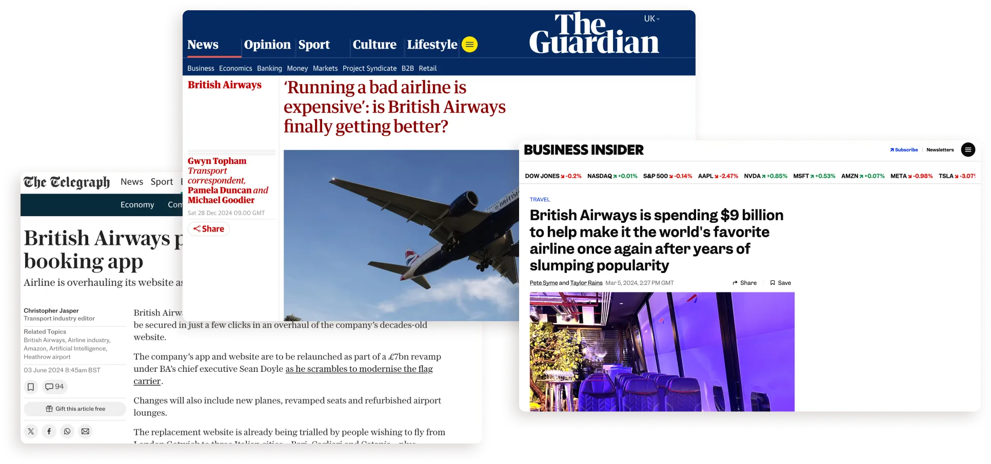
News headlines about British Airways’ digital problems and its new app, from the Guardian, the Telegraph and Business Insider.

Starting afresh

Casting the net wide I led a design sprint with teams from across BA who handled parts of disruption, such as airport operations, CRM and the call centre. This built relationships and created alignment, allowing me to follow-up with a thorough service mapping of disruption that visualised its problems and where they sat.

A service map of the disruption journey and a design sprint workshop with teams from across BA.

Invol for app

Democratising disruption

Designing for mobile was a different proposition. Achieving a 95% success rate when we tested a prototype in Heathrow, new pages and ways of catching the user allowed us to create a truly robust disruption tool.

App screens: "Let’s get you on your way again" and "Your departure airport has changed".

Adding ancillaries

Answering the 88% of customers demanding information about extras they had bought, we achieved this by allowing users to manage everything from seating to baggage within the new disruption tool.
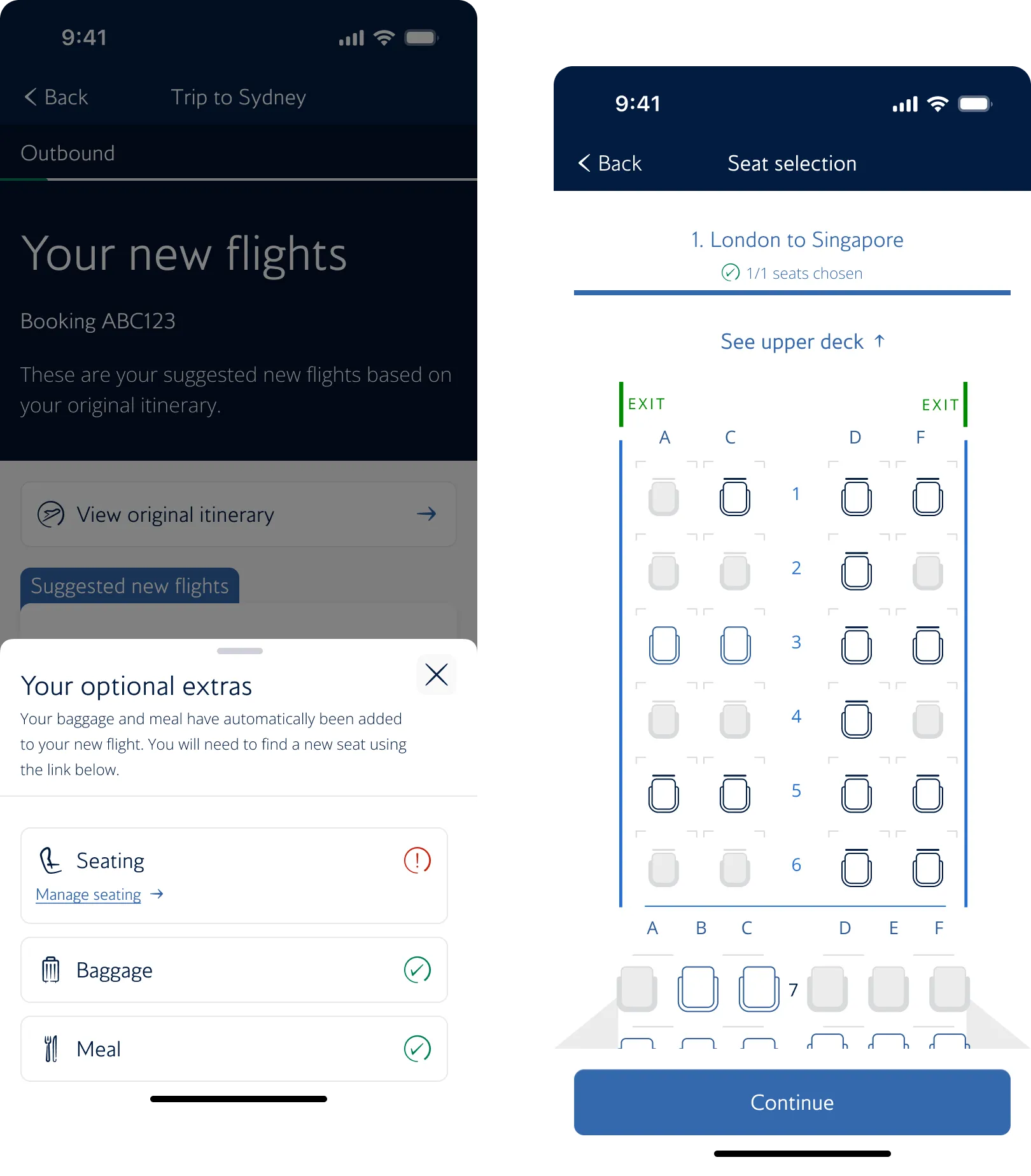
App screens for keeping optional extras and choosing a new seat during a disruption.

Digitising compensation

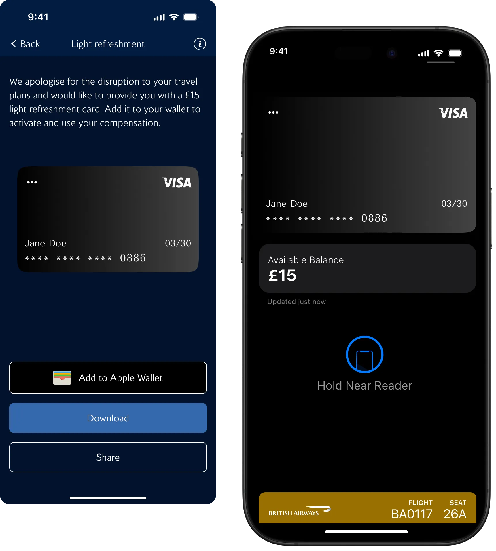
A little-known part of BA's disruption offering is that we offer customers light refreshment vouchers. These were, however, paper based. With our new remit, we digitised that and made it super easy to access via the app.

App screens for a light refreshment voucher that can be added to Apple Wallet.

Invol 2.0

Sadly I didn't get to see the project through to completion; however, the pride I feel having dragged Involuntary Disruption out of the dark ages and into the 21st century is something I'm very happy about and I look forward to seeing how it continues to evolve.
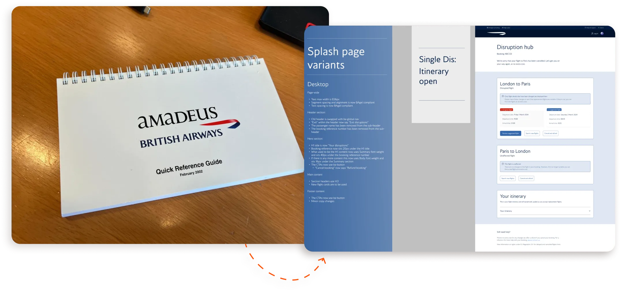
The Amadeus British Airways quick reference guide beside splash page designs for the new app.

What I learned

A man giving a knowing smile.
  1. Leadership: Starting out in a product squad that had little to no design experience was a significant challenge, but it presented an opportunity for me to step up into a design leadership capacity, something I enjoyed and really hope to continue.

  2. Accessibility: Learning about and utilising an accessible design process has been one of the most important things I've developed while at British Airways, evolving my skills and teaching me to see design through this important lens.

  3. Rapid testing: Getting very familiar with User Testing and working with some very talented researchers, I learned the importance of rapid user testing to gather useful insights quickly. This enabled me and my squad to make quick decisions when needed, proving invaluable.

  4. Taking the initiative: Whilst this mightn't be something I learned to do at British Airways, it is something I developed. When there was a need to work on something unfamiliar (such as the boarding pass) I didn't pass on the opportunity, always seizing on them to develop my skills.

See more?